Nextiva: Cospace – Business communication platform
MVP design
Company/client: Nextiva
Project: Cospace
App type: SaaS, communication, CRM
Product phase: MVP
Platform: web application
Industry domain: telecommunications
Customer type: B2B
My role: lead UX/UI designer
My responsibilities: end-to-end product design from discovery to production; business requirements elicitation and analysis, user research, information architecture, prototyping, UX, UI, design lead.
📦 Summary
Project overview
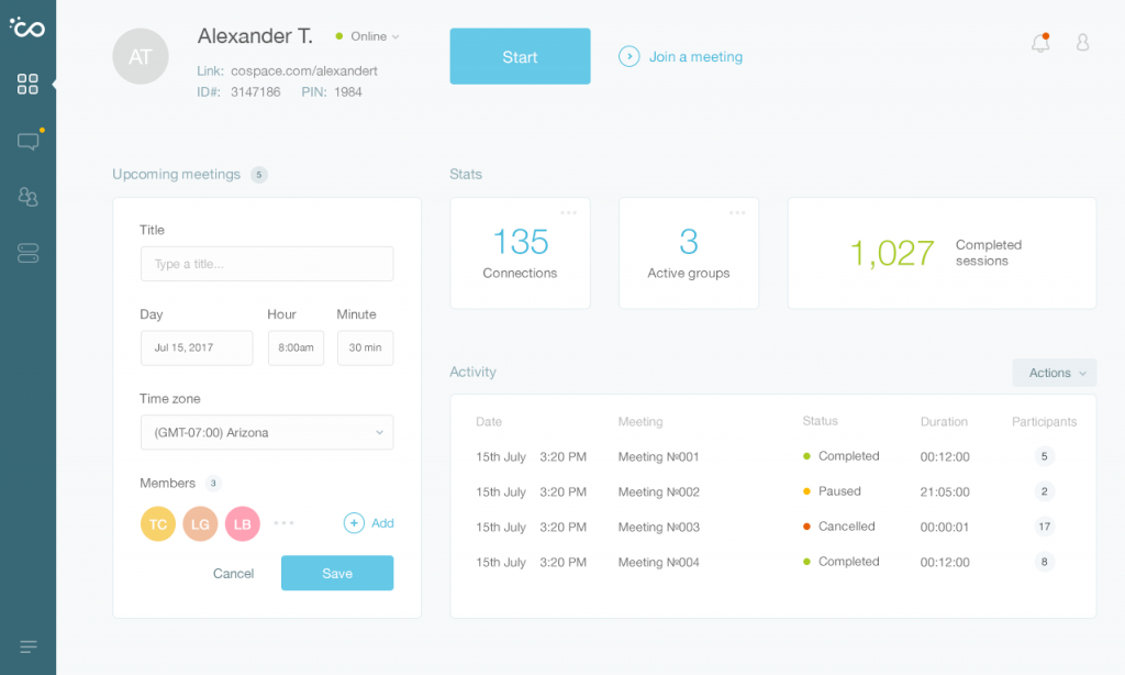
Cospace was a new standalone product of Nextiva company which was planned to integrate into the CRM system. It’s a web-based SaaS application. Its main purpose and primary function is secure communication within organizations via text messaging, video and audio calls.
Project goals
The main goal of the project was to create an MVP to launch and test on customers.
Design results summary
High fidelity design ready for development.
📌 Challenge
The company found demand growth on online communication features so it decided to create a solution to validate it.
The main goal of the project was to create an all-in-one communication platform with minimum viable features set from scratch.
As it was one of the key strategic products of the organization, I closely collaborated with the CEO and a product owner to gather requirements directly and move fast to deliver a complete solution.
🛠️ Solution
The initial problem was to gather requirements to define the minimum viable features set.
Because of the lack of initial input data and unstructured requirements, I decided to perform competitive evaluation research to understand our opportunities and get a clear vision of the final product.
Based on analyzed data and refined requirements, I created user flow diagrams to see the main user flows and how the user interacts with the system through different touchpoints to achieve his goals and solve the primary problem.
The user flow touchpoints helped me outline the key screens of the application. From now, I could make sketches of the initial UI to define the first design layout and the essential information to be included.
When I made an initial set of sketches, I started working on the information architecture to refine UI layout and prioritize data based on business requirements and user needs. I moved to the creation of the wireframes so that I could focus on the details that affect user experience to make the structure intuitive and user-friendly.
To make sure the system doesn’t have any blockers throughout the user flows, I linked the wireframes into a clickable prototype so we could test different cases and check if it works seamlessly. We tested the prototype on people to see if they can achieve their primary goals fast and easy. I performed … During user testing we discovered that some features would overwhelm the user experience and could be refined to make it more intuitive and efficient.
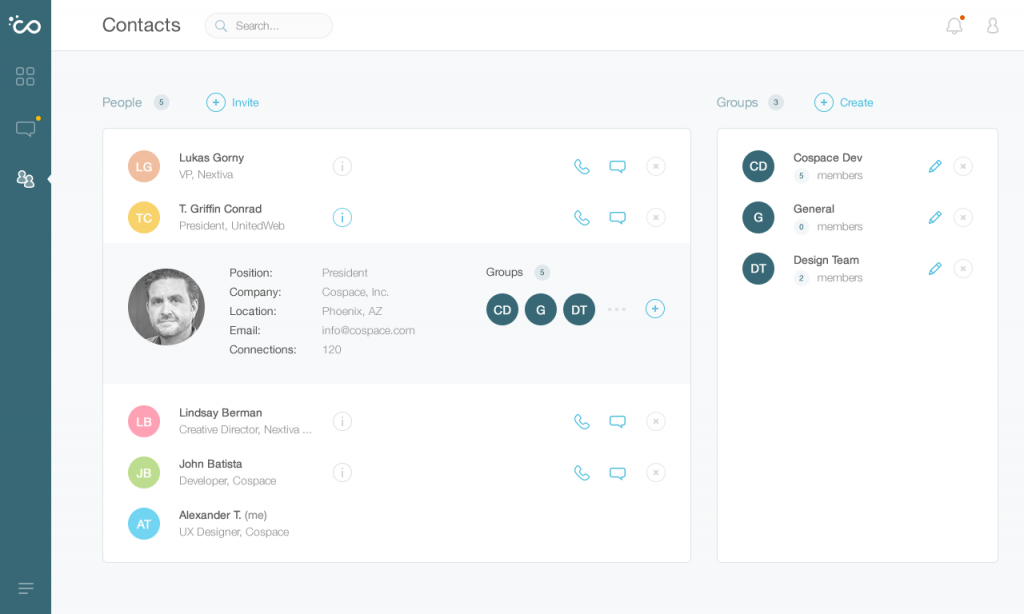
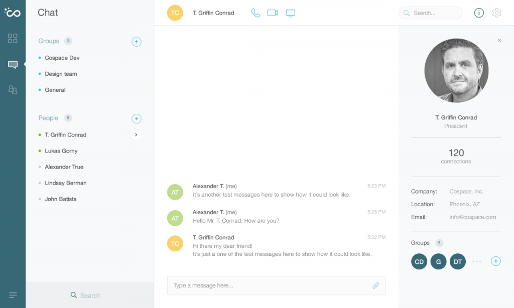
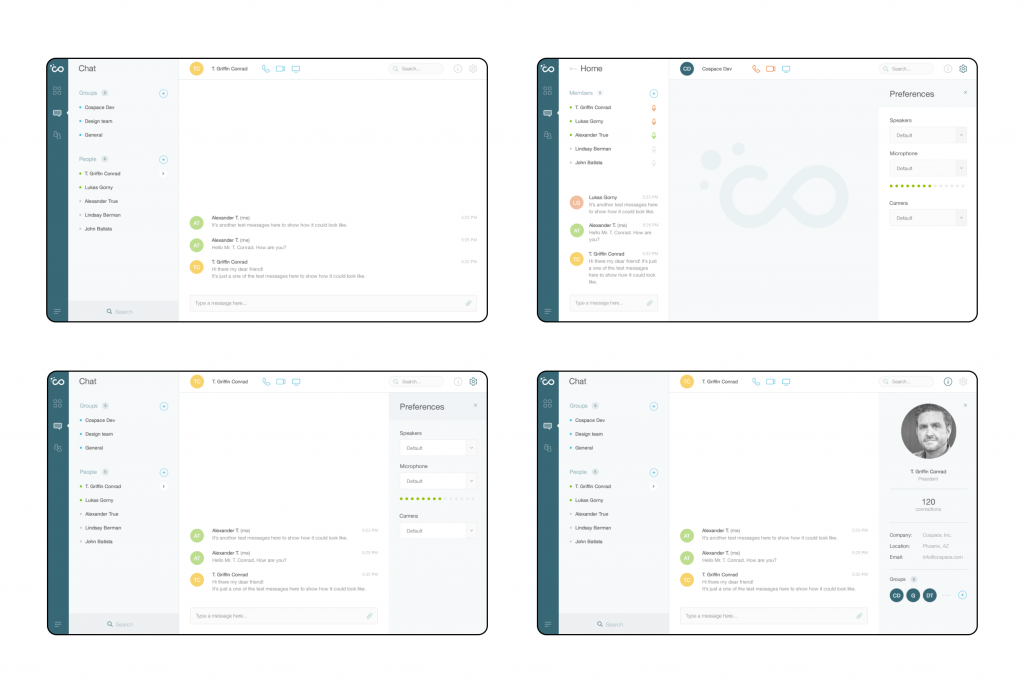
After a few iterations of working on the information architecture and seeing no blockers, I moved on to the high-fidelity design. As I started from scratch, I created a design system to ensure the UI is consistent and smooth, also to make it flexible and easy to maintain for future iterations. I defined color palette and typography. I used a combination of 2 grid systems – columns and squares, so frontend developers could easily implement it and make it responsive to different viewports (screens) with less effort.
At the end of the step, I delivered hi-fi mockups and design system ready for development.

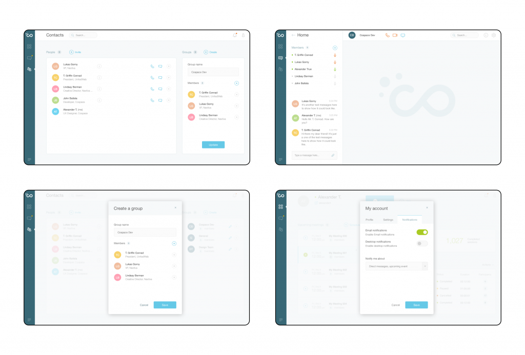
🎯 Results and outcome
As a lead UX designer on the project, I set up end-to-end design processes and delivered an MVP ready for development. During the development process, I also collaborated with a dev team and supported them to ensure that they have everything they need for solution implementation.
The first step for this project was to build an MVP to introduce to the customers. The next step was to integrate the app into the main client’s product – CRM.
I learned that it’s crucial to gather correct initial business requirements and discover user needs to define appropriate features set and processes so the system would be beneficial for both sides.