Code Intelligence: fuzz testing application
Platform design
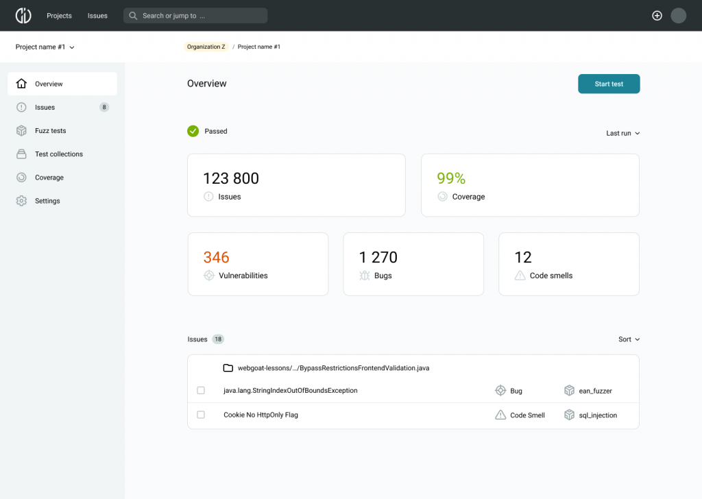
Company/client: Code Intelligence
Project: CI Fuzz
App type: SaaS, dev tools
Product phase: growth
Platform: web application
Industry domain: software development
Customer type: B2B
My role: senior product designer
My responsibilities: end-to-end product design; information architecture, prototyping, UX, UI, design lead.
📦 Summary
Project overview
Code Intelligence enables companies to simplify their software testing processes. CI Fuzz app enhances security testing efficiency for experts and enables developers without IT security expertise to perform continuous automated security and reliability tests.
Project goals
On this project, my main responsibility was to establish and lead all design processes and closely collaborate with an engineering team. So I lead UX design processes to help develop a whole system.
Design results summary
Besides the design workflow and processes I delivered:
High-fidelity UI design;
Design system;
Development ready design materials;
Ongoing maintenance and support.
📌 Challenge
When I came to the project, it was already an initial MVP developed with basic functionality. It was a one-page web app. Since the company was growing (and still is) it was decided to expand the product and its new features. As the solution is quite unique and complex due to its software development tool nature, the primary goal was to implement upcoming features and create a system that would be user friendly and could seamlessly adapt to any product changes.
My primary responsibility was to continuously investigate the requirements and come up with the most effective solutions to build and evolve the product according to actual changes.
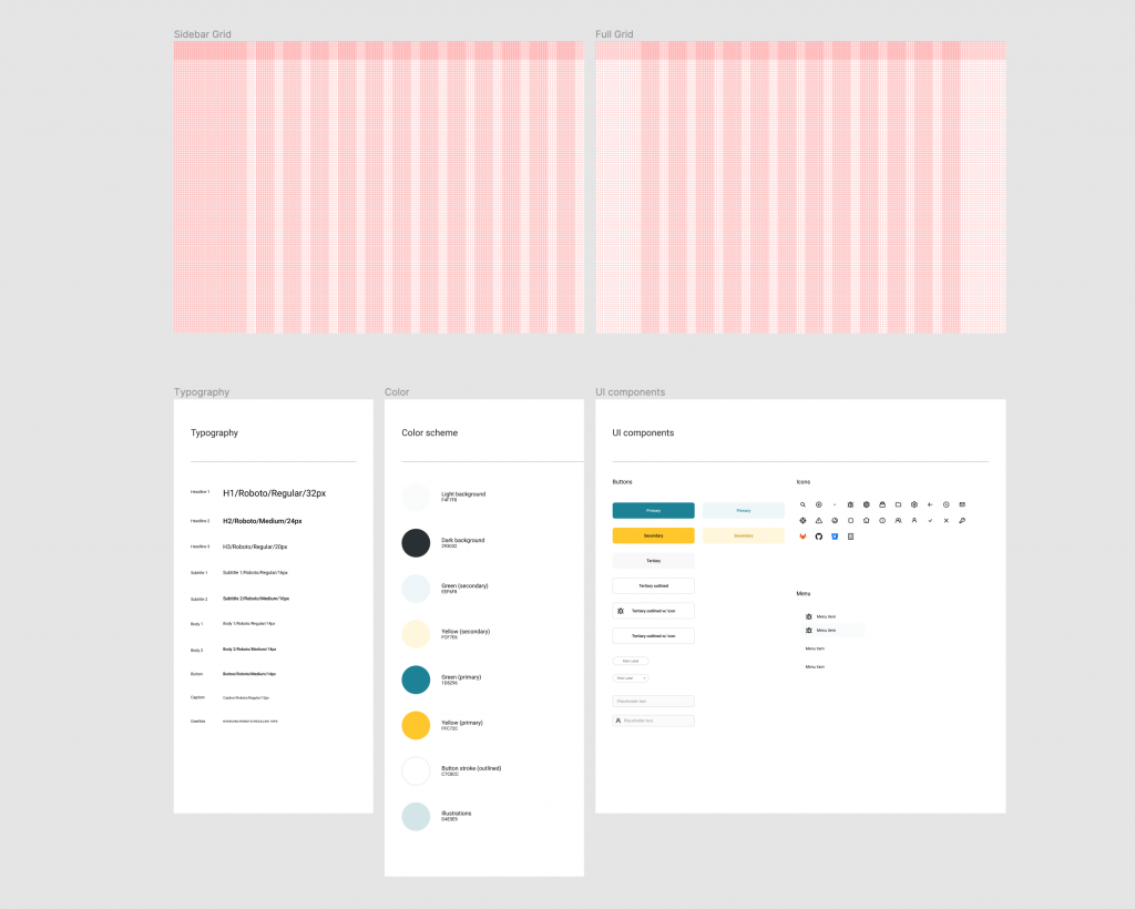
Also, one of the major GUI tasks was to create our own design system and visual style. Because an initial MVP was developed with the MaterialUI library and its default UI components. We wanted to come up with a more flexible system that would suit our needs.
During the work process, I closely collaborated with the chief product officer and development team.
🛠️ Solution
Because it’s a complex and highly technical application, we worked on it iteratively in an Agile environment to develop and release new features fast. Depending on the task and requirements, I used different approaches and methods to create design solutions.
To start the project, I needed to have a clear vision of the product development directions. For this reason, I closely collaborated with the product owner to gather necessary requirements and customer feedback.
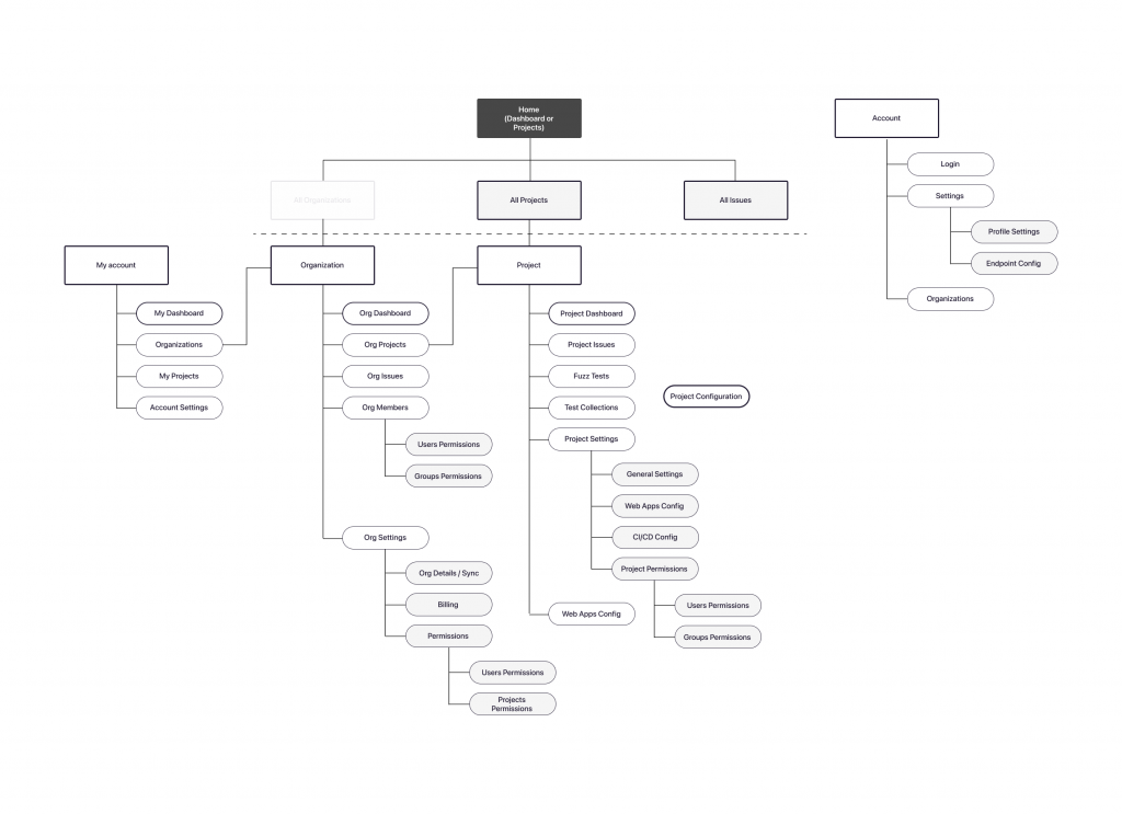
As we only had a one-page application type, the first step I decided to take was working on the information architecture because we were going to grow further and add more new features.
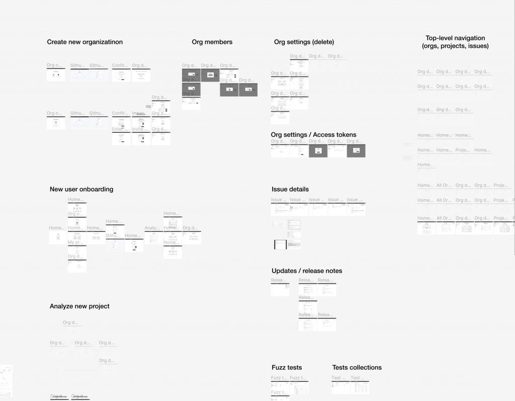
Based on the initial requirements, I created an IA sitemap to see which screens we were missing and how they are linked with each other. Some user flows and features had irrelevant data, so that’s why I decided to split it into different screens. It also made the app more accessible and eliminated unnecessary information in many places, so the user could focus on the relevant data only.
The IA sitemap also helped us manage global navigation throughout the app.
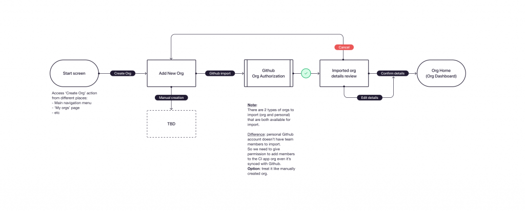
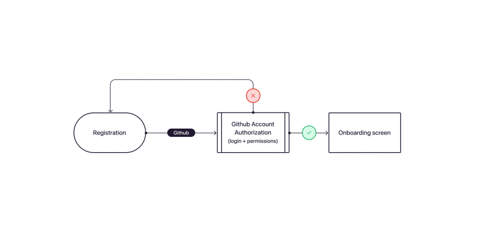
For new user flows, I created user flow diagrams to ensure that the user doesn’t have any blockers on the journey to his/her primary goal. It helped me elicit gaps and improve the user experience.
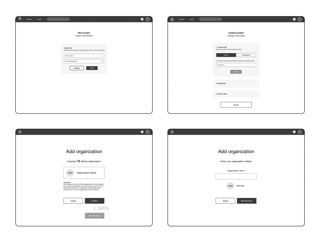
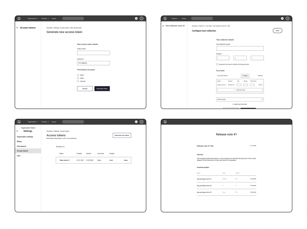
When it came to the information architecture on each screen, I made concepts with wireframes to quickly organize the data structure based on the user priorities, patterns, and UX principles. Usually, it’s the most powerful tool to generate UI ideas, collaborate with a team, and test with customers. Wireframes allow iterate quickly and focus on usability first.
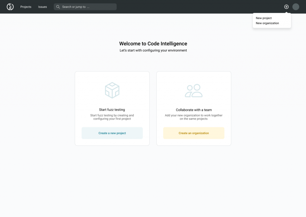
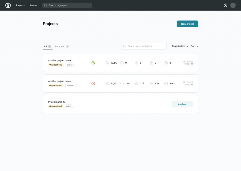
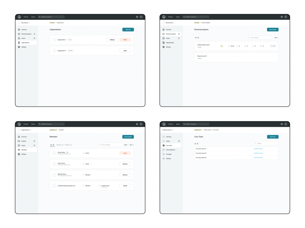
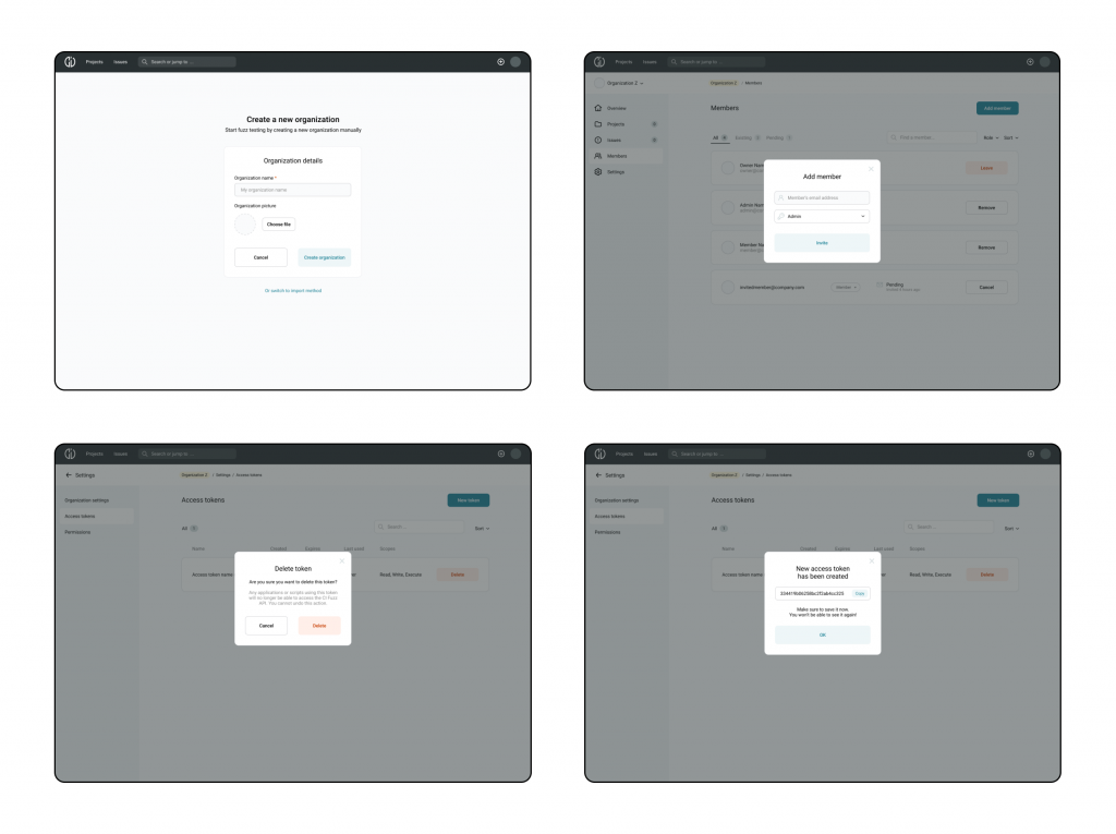
As I was the first and single designer on the project, I had to create a whole design system from scratch. Based on the wireframes I made high fidelity design mockups, so developers could get them ready for coding. I also defined the grid system for different layouts. And since we were going to switch from the MaterialUI library, I made a new visual theme that was aligned with the company’s brand identity.
IA sitemap
User flow diagrams
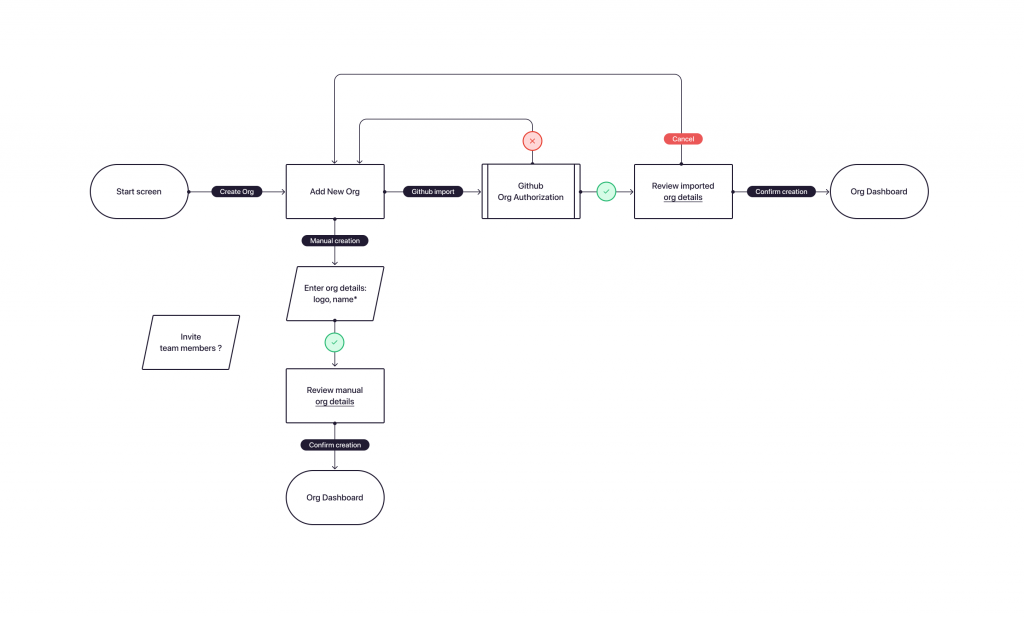
Wireframes
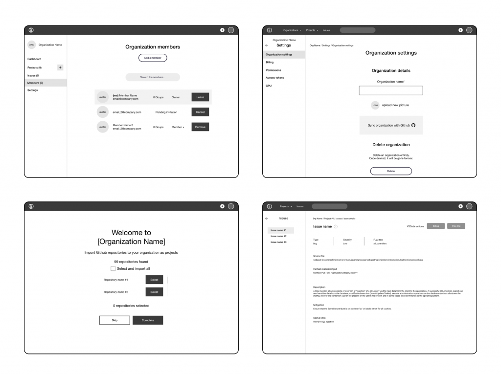
High fidelity UI design

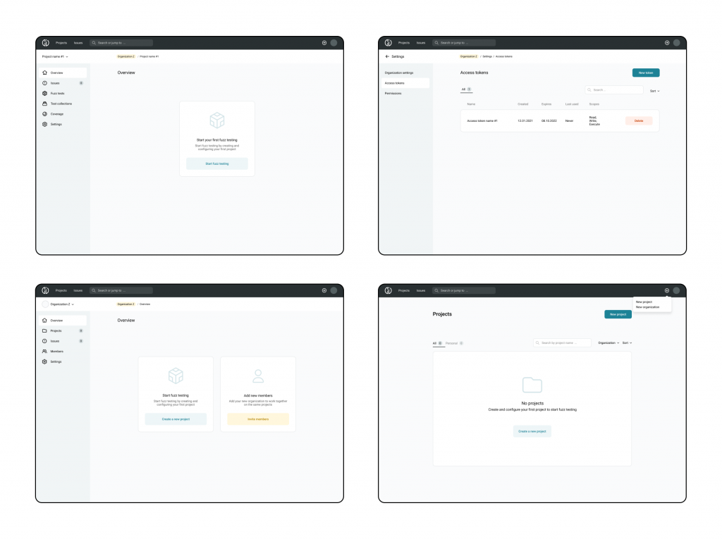
Design system + UI kit
🎯 Results and outcome
We made a great job implementing new features and user flows in the app. However, there is still a lot of work to do because the product is growing and customers request more new features.
During the work on the project, I learned a lot about the software testing and development environment. It was a challenging project because of the unfamiliar and technical data I had to work with.
I designed complex solutions that made the system user friendly and flexible to changes.
As a result, I helped the company build a product that uses unique technology and that is now used by customers like Deutsche Bank, Huawei, Audi, BOSCH.