Autec: XMP2GO – Access control mobile app
Native mobile app MVP design
Company/client: Autec
Project: XMP2GO
App type: SaaS
Product phase: MVP
Platform: native mobile application
Industry domain: access control
Customer type: B2B, banks, national armies, power plants.
My role: lead UX/UI designer
My responsibilities: end-to-end product design from discovery to production; business analysis, user research, information architecture, prototyping, UX, UI, design lead.
📦 Summary
Project overview
Autec is a hardware manufacturing company based in Bonn, Germany that is focused on access control. Its main products are facility door locks for organizations with high-security requirements: banks, etc. Primary customers are employees and clients of these organizations.
The company is also developing its own software to handle hardware products. So far, the main applications were for desktop use only and all customer interactions were made mostly with physical keys and cards.
The company found an opportunity that using a mobile device is more flexible than a physical key. So the main problem arose for the development of a completely brand new mobile application.
Project goals
Develop a native mobile application MVP for iOS and Android platforms.
Design results summary
I established UX design processes to help develop an MVP solution.
On this project, my main responsibility was to establish and lead all design processes and closely collaborate with an engineering team.
Design results and deliverables:
Hi-fi mobile UI design for both iOS and Android platforms;
Design system;
Development ready design materials;
Ongoing maintenance and support;
📌 Challenge
There are many solutions nowadays that we can use to manage our personal information and store it online, on the cloud. It usually works fine for accessing digital products and websites. However, most of the solutions operate via the cloud, completely or partially. Some organizations require higher security standards to assure everything is safe as much as possible.
The main challenge was to implement cloudless technology to receive, manage and use personal credentials.
The primary goal was to develop an end-to-end working solution so the users could achieve their primary goals without blockers, and so the developers could implement the design solution into an MVP, so the customers could use it as soon as possible to receive their feedback and then iterate based on real users’ data.
🛠️ Solution
⛏️ Gathering business requirements
To get started, we needed to get a clear vision of what should be done and implemented in the MVP. For this reason, we had to understand the business requirements first, so we could convert them into the project specifications and set measurable and proper goals for the development team.
At the end of BA research, we discovered high-level requirements:
- It should use cloudless technology to receive and manage credentials.
- Branded app for customer organization; (business) The visual design should be customized and branded for use by different companies.
- RTL, and other localizations;
- Native app for iOS and Android;
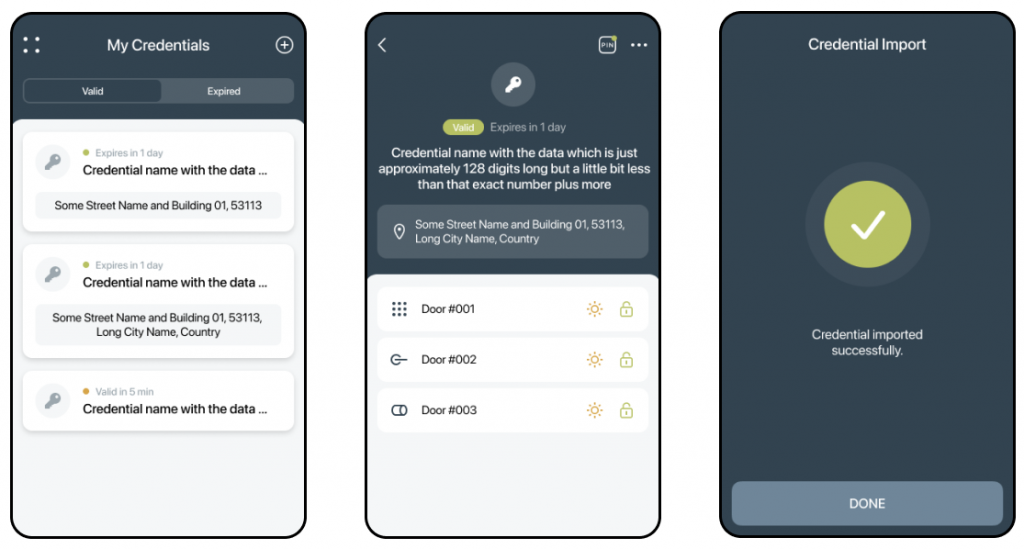
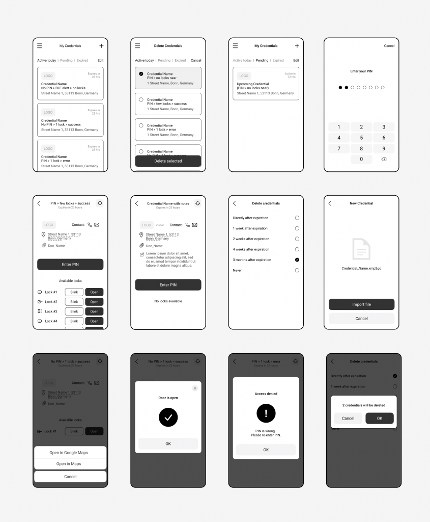
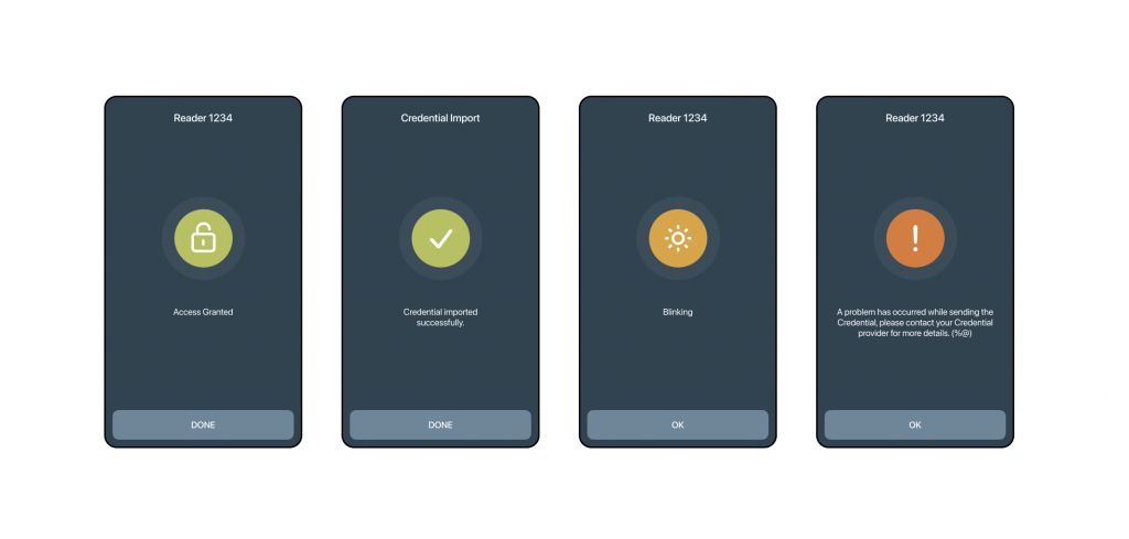
- Receive, import, view, manage and use credentials to open the door;
- Additional security level – PIN for the credential;
- Credential information: credential name, facility address, expiration date, etc;
To fill potential gaps in the UX we also identified stakeholders and how the solution depends on them.
🔍 User research
To have a clear vision of the solution that we wanted to achieve we had to understand user needs and problems first. Hopefully, the client has already had a current customer base so we could explore the audience needs, preferences, common behavioral patterns, and expectations.
At the end of the user research, we learned that the target audience is quite broad (based on age, region, language, etc), so I decided to move further with standard UX patterns to make sure the app is accessible for everyone.
🗓️ Planning
We combined high-level requirements and user priorities, and translated them into epics and broke them down into user stories, then we did decomposition into smaller user stories that represented functional interactions. Based on the user’s primary goals and business requirements, we prioritized user stories and eliminated unnecessary ones that could increase development time. That allowed us to focus on the primary user flows first to implement MVP features set first and iterate from that point.
User stories helped me define the main user flows and identify the critical interaction touchpoints between the user and the interface.
🧱 Information architecture
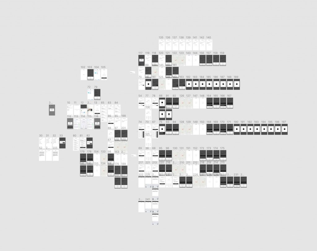
Based on the user flows I defined the key application screens.
To define the essential information types that are related to each interaction touchpoint, I made hand-drawn low-fidelity sketches where I outlined the initial design layout.
Then I translated the drafts into high-fidelity wireframes and refined the essential information in detail to make the structure intuitive and user-friendly. I prioritized data (IA) based on the user needs – I kept in mind the user primary and secondary goals (from our user stories) to create a clear hierarchy in UI that would make elements accessible based on their priorities. Also, from the business requirements, it was essential to make the system adapt to any localizations and RTL support, so as a result, it impacted the UI structure a lot making the vital components and inner elements fill the whole app’s width.
During the process, I used Jacob Nielsen’s usability heuristics to make the system accessible and user friendly.
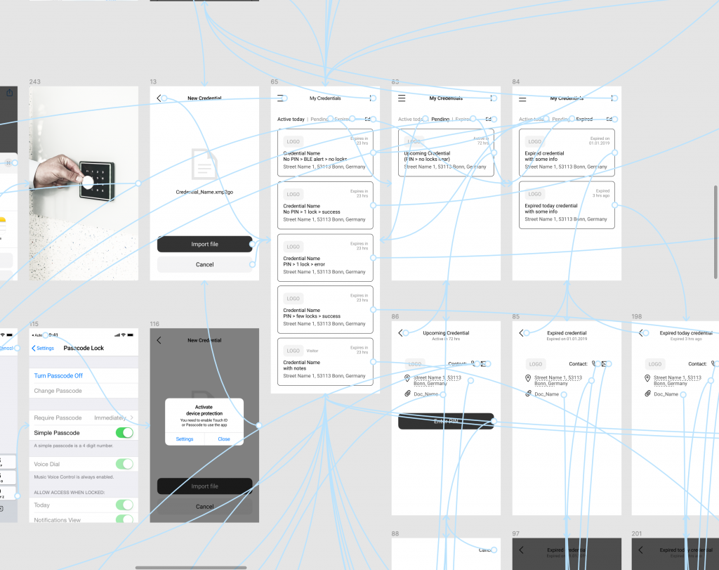
To discover potential gaps in the interaction process, I linked the wireframes into a clickable prototype to test the main user flows and check if everything works seamlessly and the user journey doesn’t have any blockers on the way to the user’s primary goal.
After initial prototype testing, we found that we need to iterate and refine the wireframes in order to manage details that vary from the credential data types in different scenarios. So I created wireframes for each use case to make sure we covered all user flows.
🦄 High-fidelity GUI design
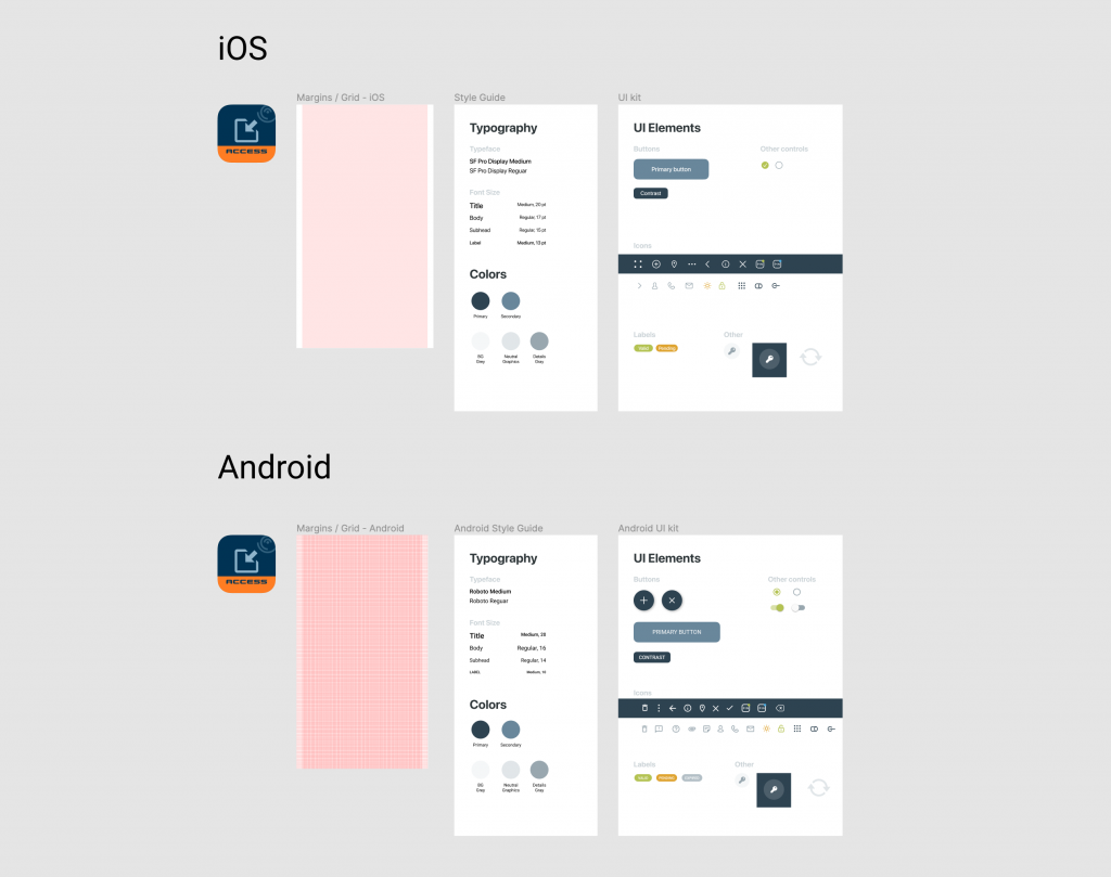
High fidelity design mockups and design systems for each platform (iOS and Android). I used Google Material Design and Apple’s Human Interface guidelines for each application type, so it affected some UI components.
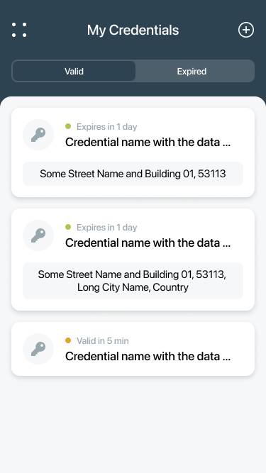
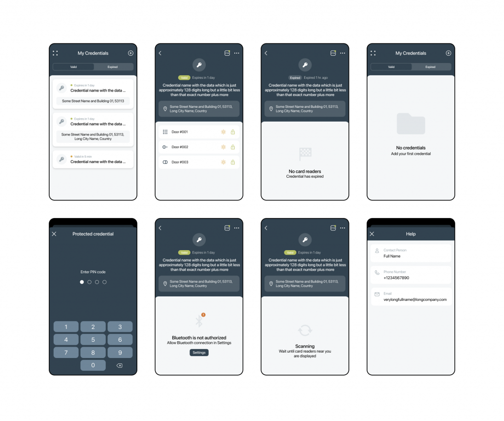
iOS
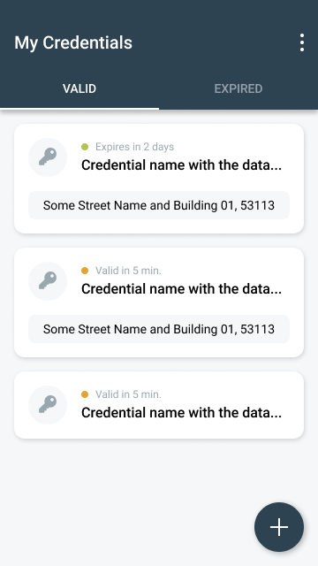
Android
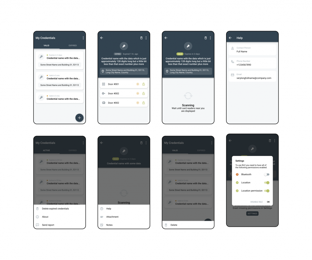
Micro-interactions
UI Details
Design system + UI kit
🎯 Results and outcome
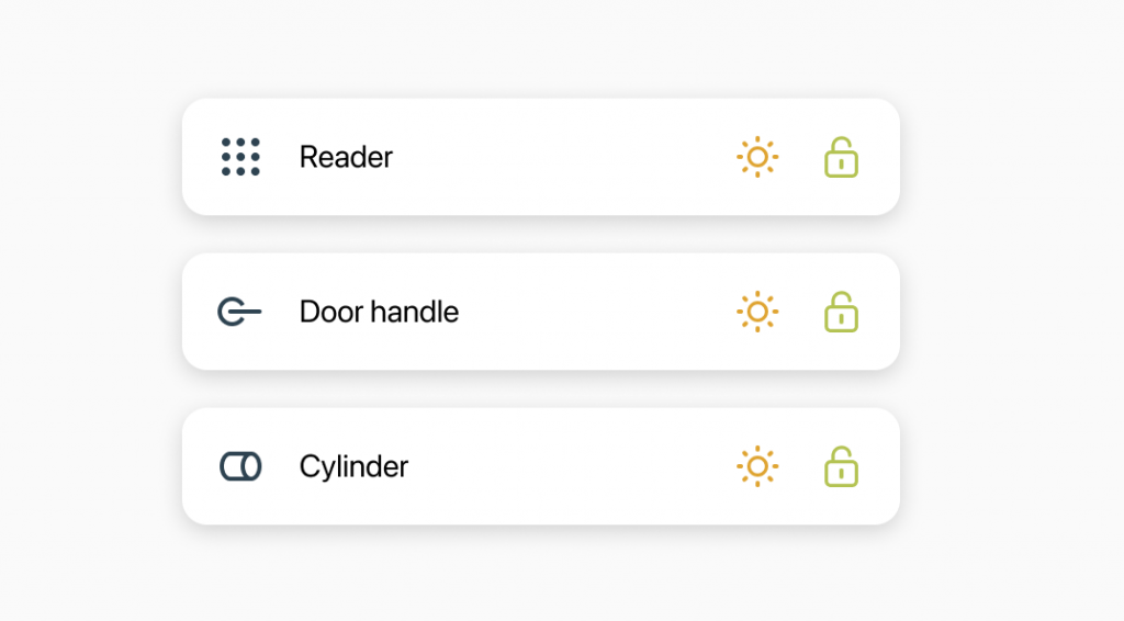
The real design challenge was to create a solution that would allow the user to use a mobile device to interact with hardware via Bluetooth. Thus, I needed to show this communication in the UI through dynamic micro-interactions and states in the easiest way for development implementation and to keep it user friendly.
Another complex job was to make different UX flows based on the credential timeframe, protection level, and the other variable details. So I had to focus on the information architecture to make everything accessible and consistent throughout the whole system.
It worth mentioning that the app was developed for both iOS and Android platforms, so I used different approaches and design patterns that affected the UX and UI. Although it’s not mandatory to 100% stick to the platform guidelines, it saved time for developers to implement native components and not to re-invent the wheel, and it would ease the publishing process to the stores as Apple and Google have their own preferences and recommendations to follow it.
As a result, the product is used by customers in organizations like banks, national armies, nuclear power plants, etc.